MUSIC MAGAZINE EVALUAION
In what ways does your media product use, develop or challenge forms and conventions of real media products?
In what ways does your media product use, develop or challenge forms and conventions of real media products?
Front Cover

Masthead
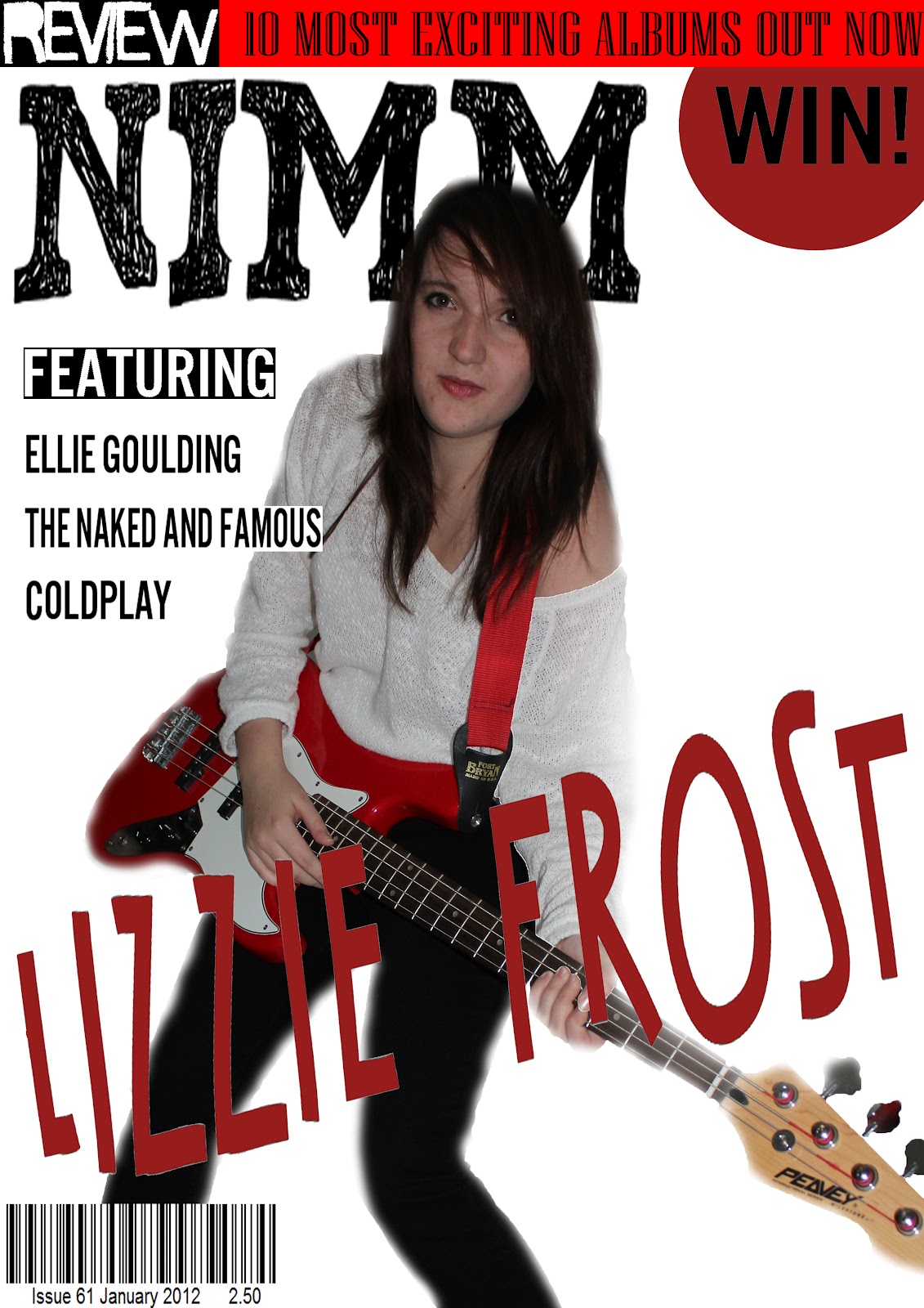
The masthead is the part of the magazine that is aimed to show the name/logo and sometimes the catch-phrase of the magazine. My final masthead consists of my magazine name/ logo. I have used an acronym of the title of my magazine: ‘NIMM’ which stands for ‘New Indie Music Magazine’. By researching into other music magazines I have learnt that a short catchy name helps people to remember it. It will also be easy for people to say and hopefully will also stand out against other magazine when sold. For example: ‘NME’ magazine stands for ‘new musical express’ but many people know the magazine by its shortened term.
I also noticed that on the masthead of some issues of NME they have created a line underneath the logo with the words ‘new musical express’ but on many others they have not included it. I believe this is because the magazine is very well known and so they do not need to include it for every issue. I decided to create a line underneath my title/ logo to show what it stands for as my magazine will not gain popularity straight away. The colour of NME’s logo changes from issue to issue. This allows it to fit in with the main image they use. I have used a simple, large font for my logo and have used the colour black. This colour fits in with the style and image of this month’s issue. As my logo consists of one block colour this will allow it to be able to change colour throughout issues. The masthead is important for a magazine as it allows the audience to recognise which and what type of magazine they are looking at.


These two issues of NME show how the line ‘New Musical Express’ has/ has not been used under the logo NME.
Main Image
The main image is used to attract the audiences’ immediate attention. This convention of a music magazine is the one most likely to attract readers for a number of reasons. For example: In every issue of ‘NME’ or ‘Q’ magazine, a celebrity icon is the subject of the image and is nearly always a medium close up shot (sometimes a long shot for members of a band).
The main image also relates to the genre of a music magazine. For example: ‘Kerrang’ magazine features images of celebrities within their genre of heavy metal/ rock music and not a celebrity from the pop music industry. Therefore when setting up my photo shoot I needed to think carefully about how the mise-en-scene would connote my music magazine. As I decided my genre to be Indie I would need to style the model/ scene in an Indie style way.
Through researching Indie bands/ magazines and fashion, I realised there were two main types of ‘Indie’. The first being Indie-rock, having a more harsh, bold look in fashion with musical sounds like electric guitars & drums. The second Indie-pop, which had a more relaxed, bohemian look in fashion with sounds like jangling guitars, keyboard & synthesisers. Both types of Indie seemed to pull away from mainstream music and clothing. (Indie stands for Independent)
According to Wikipedia the difference between the two Indie music types is: ‘Indie pop differs from Indie rock to the extent that it is more melodic, less abrasive, and relatively angst-free’
 This image shows Florence Welch who is currently signed to a major label but I believe the music and fashion is in style with the Indie Pop genre.
 This image shows Florence Welch who is currently signed to a major label but I believe the music and fashion is in style with the Indie Pop genre.
This image shows an independently signed band ‘The Strokes’ who I believe fit in with the Indie Rock genre.
I took two sets of photographs in my photo shoot: one consisting of an Indie Pop look and the other Indie Rock. Initially I believed I wanted my front cover to give off an Indie Pop vibe- However as I went on to start my magazine drafts I decided that the images from my Indie Pop set looked too ’girly’. I then decided to concentrate on my Indie Rock images as they should be able to target both men and women. This would allow my magazine to have more readers because when I have looked at the stats for popular Indie magazines the percentage of male readers has been a lot higher than female. (E.g. NME readers: 73% male/ 23% female)

This set contains some of the images I took during my 'indie rock' shoot.

This set contains some of the images I took during my 'indie pop' photoshoot.

This set contains images that I took with the props (hat/ headphones/ clapperboard) which could be used for both genres.

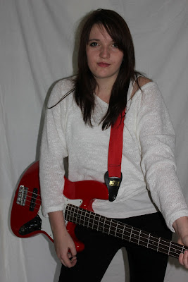
When looking at Indie Rock fashion and celebrities I could see that the clothing worn is mainly dark colours with bold accessories such as hats/ belts. Therefore I followed this convention and dressed my model in white and black. I also experimented with accessories like a trilby hat and headphones. The main item used in these photographs was the red guitar. I used this as it stood out from the clothing and looked like a typical ‘rock’ style instrument and so an image including this on my front cover would connote my magazines genre. The colour of the guitar also allows the image to stand out and so would hopefully gain people’s attention when the magazine is displayed in shops.

For my final main image I have used a medium close up to allow the cover to stand out- the model is also looking at the camera just like on NME’s magazine cover. Eye contact can help to personally involves the viewer. Using an image of a celebrity may attract fans to read the magazine and therefore the image I have taken is of a (created) celebrity.
Thumbnail Images
Thumbnail images are used to give more information and sneak peeks into what the content of the magazine includes. I have used one thumbnail image on my front cover that relates to an article inside. This image allows the front cover to look more exciting and can also draw the viewers in to read the article. However, I made the image monochrome so that it would not distract the viewers too much from the main image and surrounding headlines.
Banner Headline/ cover lines
A banner headline is a page wide headline conventionally used on the front cover of magazines. It usually relates to the main article/ image. Mine consists of the words ‘Lizzie Frost’, the name of my celebrity who appears as the main subject of the magazine. This headline is placed over the image of her so that the audience can see directly who it relates to. Underneath this text a subheading is used to show what the image is about: ‘Reveals why she is so excited for her new album’. This leads into the subject of the article and allows the viewer to see whether they are interested in reading it or not.
Barcode/ price/ date/ issue
These are all important conventions of music magazines. The information is essential as it helps the reader to buy the magazine. On most magazines the barcode is placed in the bottom right hand corner. This is so the reader can easily see it as it is placed where you would turn the corner.The price, issue & date are usually included underneath the barcode but on some music magazines, they are enlarged and placed at the top of the page. On my magazine I included all of the information underneath my barcode as I believed this would be easier to find if it was all in one place.
Skyline/ teasing contents/ splash
Teasing contents are used along the bottom of the magazine to give further insight into what is in the magazine. There were no teasing contents on the cover which I analysed but in other editions, sometimes text used saying things such as ‘PLUS…’ followed by a list of other bands and artists, were used. This would give insight into the magazine. I decided to go against the convention and not use teasing contents on my cover. This is because I had decided to use a skyline and believed the page would look cramped if I added to much to it.
Again I went against the conventions of using a skyline and splash. Instead I combined the two to create my 'WIN' advertisement. The skyline banner included the details to what was being won. I then added the splash style object to the beginning to emphasise the 'WIN'. I believe this would attract people to read the magazine as they would see the splash straight away. Magazines are usually displayed behind each other on shelves in shops and so only the top headings of the magazines are seen. This would mean my splash/ skyline would be seen and hopefully my target audience would be keen to see how they can win the tickets to see Ed Sheeran live!
Colour Scheme
I chose the colours for my magazine by using the images I had taken as a basis. The main colours in my images were white, black and red. I stuck to using these colours at first. I then added the blue colour in towards the end of the editing process and found that it helped enhance the rest of the page. Blue, red, white and black became my final colour scheme and from looking at real music magazines I felt these colours were appropriate for my genre. They would also help to attract the type of audience I am targeting (15-25 year-olds) as the colours are bright, bold and appeal more to younger ages.
The red colour could connote danger, energy, strength or power but could also connote passion, desire, and love. These are usually strong feelings in people around my target age and these young people tend to be more dangerous, daring and outgoing. The use of red in the image and the model's pose could also attract the male audience as they may associate red with desire. This combined with interest in the celebrity could entice them to read the article. Dark red is associated with rage and anger which could relate to the type of music my magazine is promoting.
FEEDBACK: FRONT COVER
From looking at my feedback I can see that 40% of the people I asked chose 3. This is around the middle of the scale which shows me I could improve on the way the magazine stands out. However, the majority of people I asked (60%) chose higher values, and believed my magazine cover stands out a lot.
The results from my second question show that 80% of people asked believed my front cover had included all the conventions of a real front cover. The other 20% stated that they believed the cover should also include a slogan and that the main model should wear brighter coloured clothing.


Contents Page
Images
For the main article of my magazine (Lizzie Frost)I used an image from the same photoshoot of the 'celebrity' to allow continuity throughout the magazine. This also helps the viewer to be able to associate the image with the one on the front cover, making it easier to find the article inside the magazine.
I also took another image for the contents that represented another article (Laurence Taylor). This makes the page look more diverse and can also draw the readers in to see this article being represented. I made sure this image was quite simple as to not distract attention away from the main article first. The image only includes dark black colours and so this fits in with the colour.
Sections
From my research into existing music magazines- I found that their contents pages tended to be very organised, including section headings to split the articles up. This made it much easier to find certain articles when looking for them. The headings I found the most of in magazines were: 'News' 'Reviews' 'Features' & 'Every Month' or 'Regular'.
I used a bold plain text for the headings and numbers. I added the page numbers next to the name of the article. However, I decided not to write 'page' in front of every number as it would be unnecessary and existing magazines I have looked at do not do this.
Subscription section
Another feature of contents pages I researched was a section that advertised subscription to the magazine. These included offers, pictures of previous issues and a page number of where to find details of how to subscribe. I decided to include my own subscription offer for my magazine as I believed it to be a good way for my target audience to buy my magazine. The price would be cheaper than buying the magazine monthly. The money would be needed upfront and so people like students can buy the subscription there and then, instead of having to find the money each month. Putting this offer on the contents page allows it to be seen by the majority of people who read the magazine. This is because most people will look at the contents to find an article they want to read.
Other
I have also kept to the colour scheme I used on my front cover. This allows continuity throughout the magazine which is a big convention in real music magazines.
In existing magazines the title is usually placed in the middle top of the page. For example: NME uses the title 'inside this week'. This is recognisable to just this brand and so I wanted to use a style of title that could be recognised as my magazines own. My style breaks the convention as it is placed on the left hand side and the letters are displayed in a unique way. I have done this because I believe the title is still easy to read but it gives an interesting look to the page that I have not seen in other magazines.
FEEDBACK: CONTENTS PAGE
I asked people in my target audience age range whether my contents page included all of the conventions that a real contents page does and I found that 80% believed it does. The other 20% stated that they thought it should contain more thumbnail images to show what is inside the magazine.


Double Page Spread
Headline
On my double page spread I used a large headline to show what the article is about. I used the artists name as this would relate to my Front cover image/ artist. This allows the audience to recognise the article and to find it easily. When looking at existing double page spreads I could see that headlines used were always in a large font and placed at the top of the page. Therefore I used a large font on my double page spread to allow it to stand out to the viewer.
Images
A convention of double page spreads is that the images used are from the same photoshoot of the artist. Therefore I used images that were taken in the same shoot as the front cover/ contents pages of my magazine. This allows continuity throughout the pages. My main image uses the whole of the left hand side space of the article. This is another convention of a real music magazine that I have followed as the main image usually takes up on whole page next to the written article.
I also added extra images (from the same photoshoot) in to allow the page to be more diverse. They make it look more interesting and allow the audience to see more of the celebrity.Other
I have included an introductory paragraph in my article to allow the viewers to see what the article will be about easily. This is placed above the main article so that it is clear to see. I have also added photo and article credits down the left side of the right handside page. This shows the audience who has helped to produce the magazine article and this is a feature used in most music magazines.
Other conventions of a double page spread are the drop cap, pull quote and arrow used in the body of the article. The drop cap makes the article look more professional and gives the reader direction so they know where to start reading. The pull quote stands out from the middle of the article to draw the audience into reading the article. The quote is from the article text and is usually something interesting the artist has said so that it attracts the audience. I have put mine in blue so that it stands out against the red background but still fits in with the colour scheme. I also added an extra information box to this page. This allows the audience to find out extra information about the artist and gives more to the page than just having the written article.
This double page spread from an NME issue shows how extra information has been used in a 'Need to know' box. It also has an extra thumbnail image next to the written article and uses conventional features such as the drop cap and pull quote.
FEEDBACK
I asked people in my target audience age range whether they think my double page spread included all the conventions of a real one. 100% of people said yes, that they do believe it includes all the conventions.

How does your media product represent particular social groups?
The genre of my magazine is Indie and this is genre is usually associated with young adults. Indie is also a style and many teens/ young adults dress in this way. My magazine represents this social group as I have used images of young artists that follow the Indie trend. This allows my audience to relate to the artists either through fashion or aspirations to be like them. The language used throughout the magazine is also informal but modern and this relates to young people. Existing magazine NME’s average age for the reading of its magazine is 25. This magazine has the same genre as mine and so using language that is young/ in fashion targets this audience.
As my magazine is not priced particularly high this represents young people who may not be able to afford much as they are still in education or are unemployed. The social classes C2, D and E represent people who are targeted to read my magazine. I have created my magazine to target both genders. Although the main image is of a female, male artists are also included and the colour scheme (blue, red, black) represents both male and female audiences. When looking at existing magazines with similar genres (E.g. NME) I found that men tended to the read the magazines more than women. For example: NME’s audience is 73% Male and only 27% female. So by making my magazine to represent both audiences equally this allows whichever gender to read my magazine.
 The age of my target audience for my music magazine is 15-25. From researching other music magazines of a similar style I have found that the most common target ages are from teen years to early twenties. For example, NME’s average audience age is 25.

As my audience is quite young I have used modern and informal language as this generally attracts a younger generation. The colours scheme also consists of bright, bold colours that tend to be used/ worn by young adults. The types of articles advertised in my magazine relate to a younger audience in music. For example: An article about the Brit Award line up will gain mainly young attention as the Brits are most commonly watched by young adults.
WIN/FREE
Celebrity

What have you learnt about technologies from the process of constructing this product?
I used Photoshop to construct my product. I have little experience using Photoshop and so I learnt many new useful tricks to help create my final pieces. I practised mock ups of my magazine cover on here first as I started to learn the basics to the layout of a music magazine. These are my two mock ups using existing images from the web. I learnt how to use the text tool, 'cut out' the images with the quick selection tool and place each object in the conventional place of a music magazine.


I then began on my own music magazine. The first main thing it helped me to do was edit my images. It took me many times using the quick selection tool to cut out my images to how I wanted them! The white of the background and of my models outfit made it harder to use the selection tool- but after practise I managed to come out with an image I was happy with. The photographs below show the before and after of one of my uses of the selection tool.

Original Image Cut out/ selection tool
These images also show how I learnt to use the blur tool and the spot removal tool in Photoshop. I removed spots and blemishes from the models face as this would enhance the images and allow them to look like part of a professional photoshoot for a magazine. I used the blur tool to soften the edges of the images to allow them to blend in with the rest of the page but also to stop them looking like they were just 'cut out'. I also learnt how edit the layer properties and add a shadow around the cut out image to make it look more realistic.


Original Image Blur/ spot removal


Original Image Shadow
I also learnt how to use the text tool inside Photoshop. I used this throughout my magazine for the main headings, cover lines and other text. I used the same font everytime to keep continuity in my magazine but some text I used a different font for so that I could emphasise it. For example: The 'REVIEW' text on my final front cover has a different font style to allow it to be noticed.

Looking back at your preliminary task, what do you feel you have learnt in the progression from it to the full product?


From looking back at my first task I feel I have improved so much since the beginning of the course. The main thing I believe I have improved on is the use of Photoshop. I have learnt many new things in Photoshop which have allowed my music magazine to look more professional than my college one. For example: I learnt how to use the selection tool to 'cut out' my images and place them on a different background. This was something I had not tried during the creation of my college magazine.
I have also learnt more about the layout and conventions of magazines. From analysing more magazines it has helped me to create a music magazine that could be easily sold next to real magazines without a question. Looking at my college magazine now, I can see how I could improve it straight away. My college magazine looks particularly plain compared to my music magazine and I believe this is because I did not know very much about conventions at the time. E.g. the use of the masthead/ coverlines/ splash.
As our task was to create not only the front cover but also the contents and double- spread pages, I believe this has enabled me to learn something new: the importance of continuity from the front cover through the magazine. When looking at existing magazines I could see that the front cover image always relates to the double page spread article and the main image on the contents page. Another use of continuity would be the colour scheme (E.g. I used blue/ red/ black/ white on all pages) This was something I was able to improve on from doing my college magazine front cover & contents. From looking at my feedback I can see that I have accomplished this as 100% of people believe my magazines layout/colour scheme runs throughout the magazine pages.

What type of media institution might distribute your media product and why?
When looking at my music magazine I believe it has a similar style to NME and so I have researched into IPC Media who publish NME. IPC publish many magazines but only two music magazines (NME and UNCUT). This media group could be a possible publisher for my magazine as they do not already have many music magazines like other publishing groups (E.g. BAUER which publishes 3 music magazines). However, the two magazines do not compete against each other as they specialise in contrasting music. Therefore, as my magazine is similar to NME it may struggle with this company.
When researching BAUER their 3 magazines are very different to mine and so this company may be able to publish my magazine to compete against NME. However, I believe the best company to publish my magazine would be CONDE NAST as they have not already got a music magazine being published.
Who would be the audience of your media product?
 The age of my target audience for my music magazine is 15-25. From researching other music magazines of a similar style I have found that the most common target ages are from teen years to early twenties. For example, NME’s average audience age is 25.
I created my magazine to target both genders as indie music is enjoyed by both. By designing the magazine to suit both genders could mean an increase in number sold.
When looking at social classes I believe that my target audience is mainly the D and E classes. This is as most young people are unemployed due to being in education or further education and only being semiskilled. I believe I am targeting inner directed groups of people as I think that the indie style is quite unique and people who follow its fashion stand out in their own way. However, some of my audience may be outer-directed as they long to be part of the indie style and may follow friends and buy the magazine due to ‘fitting in with the crowd’. From my feedback I can see that 100% of people asked (in my target audience age range) have chosen high values for how much they believe the target audience would be in reading the magazine. This shows me that I have succeeded in creating a magazine that's style relates to and attracts my indie target audience.

How did you attract/address your audience?
As my audience is quite young I have used modern and informal language as this generally attracts a younger generation. The colours scheme also consists of bright, bold colours that tend to be used/ worn by young adults. The types of articles advertised in my magazine relate to a younger audience in music. For example: An article about the Brit Award line up will gain mainly young attention as the Brits are most commonly watched by young adults.
WIN/FREE
I used the splash/ skyline on the front cover as I know young people would be interested by a competition to see a famous musician. The red colour of the splash stands out against the magazine and so should be seen straight away when the magazine is picked up.
Eye contact
Eye contact
The eye contact with the camera on my main image allows immediate communication between the magazine and the audience. This also personally invloves the viewer. I have also made sure that all my images throughout the magazine share eye contact with the camera/ viewer.
Text
On my front cover I have used large text to emphasise important stories in the magazine. This could attract anybody but the overall genre of the magazine should attract my target audience.Text
Celebrity
Using a celebrity in the main image on the front cover allows the magazine to be spotted by fans. The type of artist I have featured is within the genre of my magazine and so people who are fans or who like similar artists may become interested in the story/ interview.
Price
Price
The price of my magazine is fairly cheap compared to other monthly music magazines already out there. For example: MOJO magazine is sold for £4.50 and Q magazine at £.90. NME, however, is slightly cheaper at just £2.20 each month. As my target audience is young and a large percentage would still be in full time education or with low paying job, I decided to price my magazine at £2.50. This is a low price which enables my target audience to buy the magazine with ease.

What have you learnt about technologies from the process of constructing this product?
I used Photoshop to construct my product. I have little experience using Photoshop and so I learnt many new useful tricks to help create my final pieces. I practised mock ups of my magazine cover on here first as I started to learn the basics to the layout of a music magazine. These are my two mock ups using existing images from the web. I learnt how to use the text tool, 'cut out' the images with the quick selection tool and place each object in the conventional place of a music magazine.


I then began on my own music magazine. The first main thing it helped me to do was edit my images. It took me many times using the quick selection tool to cut out my images to how I wanted them! The white of the background and of my models outfit made it harder to use the selection tool- but after practise I managed to come out with an image I was happy with. The photographs below show the before and after of one of my uses of the selection tool.


Original Image Cut out/ selection tool
These images also show how I learnt to use the blur tool and the spot removal tool in Photoshop. I removed spots and blemishes from the models face as this would enhance the images and allow them to look like part of a professional photoshoot for a magazine. I used the blur tool to soften the edges of the images to allow them to blend in with the rest of the page but also to stop them looking like they were just 'cut out'. I also learnt how edit the layer properties and add a shadow around the cut out image to make it look more realistic.


Original Image Blur/ spot removal


Original Image Shadow
I also learnt how to use the text tool inside Photoshop. I used this throughout my magazine for the main headings, cover lines and other text. I used the same font everytime to keep continuity in my magazine but some text I used a different font for so that I could emphasise it. For example: The 'REVIEW' text on my final front cover has a different font style to allow it to be noticed.

Looking back at your preliminary task, what do you feel you have learnt in the progression from it to the full product?


From looking back at my first task I feel I have improved so much since the beginning of the course. The main thing I believe I have improved on is the use of Photoshop. I have learnt many new things in Photoshop which have allowed my music magazine to look more professional than my college one. For example: I learnt how to use the selection tool to 'cut out' my images and place them on a different background. This was something I had not tried during the creation of my college magazine.
I have also learnt more about the layout and conventions of magazines. From analysing more magazines it has helped me to create a music magazine that could be easily sold next to real magazines without a question. Looking at my college magazine now, I can see how I could improve it straight away. My college magazine looks particularly plain compared to my music magazine and I believe this is because I did not know very much about conventions at the time. E.g. the use of the masthead/ coverlines/ splash.
As our task was to create not only the front cover but also the contents and double- spread pages, I believe this has enabled me to learn something new: the importance of continuity from the front cover through the magazine. When looking at existing magazines I could see that the front cover image always relates to the double page spread article and the main image on the contents page. Another use of continuity would be the colour scheme (E.g. I used blue/ red/ black/ white on all pages) This was something I was able to improve on from doing my college magazine front cover & contents. From looking at my feedback I can see that I have accomplished this as 100% of people believe my magazines layout/colour scheme runs throughout the magazine pages.


