The lead up in editing to my final front cover!


Since doing my first front cover drafts I decided to keep the process logged by taking screen shots every so often as my cover changed. From looking at my first magazine drafts I decided to carry on working with the third style I had created (images shown above). The images below are the screenshots of the lead up from this style to my final front cover.


The screenshots above show how I changed my cover from the first drafts I did. I experimented by replacing the main image and the style of the page wide headline 'Lizzie Frost'.
The screenshots below show the changes from red to brown colouring in the text and skyline. I believed I had too much red on the cover and so experimented with brown/ beige to as well as red.
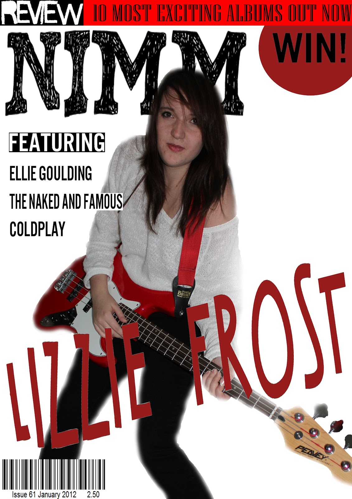
I also changed the main logo of the magazine as I went along. Here I changed it to the logo that would be displayed in my final front cover! I changed it to a bold simple title that filled the whole width of the cover. From looking at existing magazines I could see that most music magazines had bold logos that filled the top of the page. This would allow my magazine to stand out and compete with these other magazines when displayed in shops. I also changed the 'Lizzie Frost' heading to a bold plain text aswell and believed this looked more professional.
I also changed the main logo of the magazine as I went along. Here I changed it to the logo that would be displayed in my final front cover! I changed it to a bold simple title that filled the whole width of the cover. From looking at existing magazines I could see that most music magazines had bold logos that filled the top of the page. This would allow my magazine to stand out and compete with these other magazines when displayed in shops. I also changed the 'Lizzie Frost' heading to a bold plain text aswell and believed this looked more professional.


The screenshots below show how I changed the main image style. I liked the main image but I had edited it a lot and this made it look a bit unnatural. I had also made the edges of the image too blurry when 'cutting' the image out and this made it look less professional. I started again with the same image and removed spots and blemishes with the tools in photoshop. This time I made sure not to edit it too much when cutting the image out. I made the edges more defined than blurry and I believed this helped my image to stand out in a professionally looking way!


These next screenshots show my concentration on the coverlines of my front cover and how I changed the colour of parts of the magazine yet again. This time I changed the colour of the coverlines and page wide banner from brown to grey. This colour suited my magazine genre more and I think it looked better with the red parts of the magazine and in the main image. I also added a catch line underneath my magazines logo to explain what it stands for. 'NIMM'- 'New Indie Music Magazine'. I focused on the coverlines and experimented with them in different positions on the cover. I also added some new coverlines to the left handside of my magazine. I added red lines underneath them to allow them to stand out.


In these next screenshots I changed the 'WIN' splash. I didn't like the style of the splash as it looked 'tacky' amongst the other elements of my cover. I decided to move the splash to the top left and incorporate it into the skyline instead. Another thing I changed was the colour of the background of the magazine. It was a dramatic change from white to blue but once I had done it I believed it made my magazine look much more complete. I also took out the cover lines in the bottom right and added a section that could include another image. I believe this would look more interesting as another image could attract the audience better than words.


 <------ This was the last screenshot I took. I then added an image to the red outlined box and finished my final front cover!

.jpg)
.jpg)


.png)
